Client

What began as one proprietary sans-serif gradually became an entire typographic language.
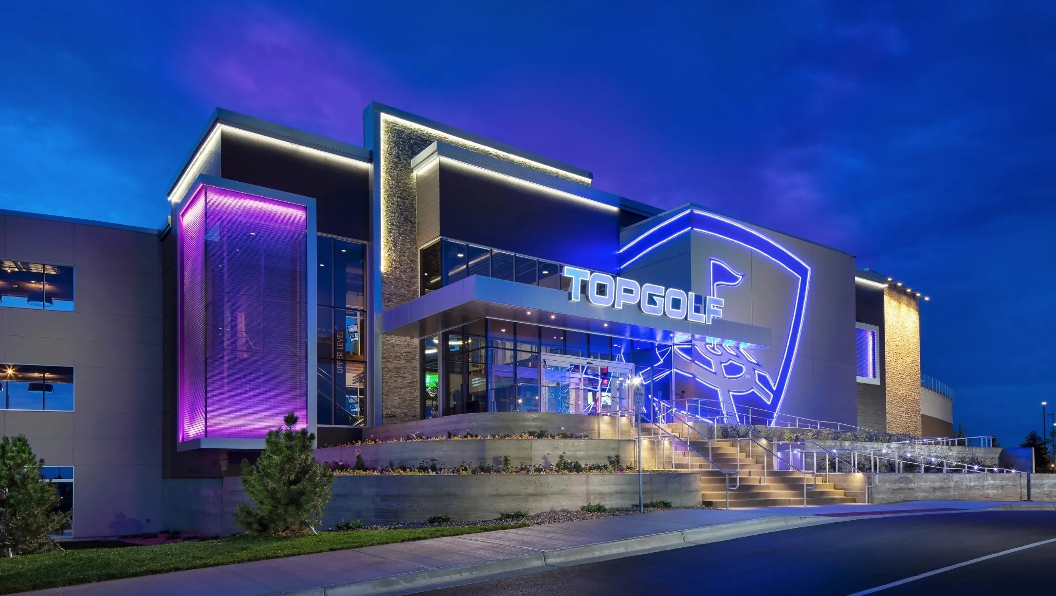
The work started with Shield Sans in 2017, in close collaboration with Topgolf Creative Director Carter Martin and designer Blake Gantz. It was designed as a technology-forward workhorse that could function almost anywhere the brand needed it, from interfaces and screens to signage and marketing. A condensed version was developed alongside it for apps, software, and situations where information had to fit into tighter spaces. The system kept expanding as new needs emerged. Tee Line Serif followed in 2019 as a softer, more expressive counterpart for display and editorial use. That same year, the custom TOPGOLF lettering Carter had drawn for the wordmark was expanded into a complete 12-style family. What started as a single typeface became four connected families, each solving a different part of the brand.
46 proprietary fonts built to carry Topgolf across every part of its world.
The completed system included 16 styles of Shield Sans and Shield Sans Condensed, 18 styles of Tee Line Serif with true italics, and a 12-style expansion of the Topgolf brand typeface. Each family had a specific job. Shield Sans handled the everyday work. The condensed styles made room where space was limited. Tee Line brought contrast, softness, and expression. The Topgolf family extended the recognizable character of the wordmark into a broader display voice. Together they gave the company enough range to work across technology, physical environments, marketing, and brand communication without reaching outside the system.
A typographic system Topgolf could own, control, and use everywhere.
The fonts became part of nearly every layer of the brand: apps, software, game interfaces, hardware, venue screens, signage, environmental graphics, advertising, print, sub-brands, logos, digital marketing, and internal communication. Ownership meant Topgolf was no longer dependent on outside licensing or a changing collection of commercial fonts. Designers and developers could work from the same visual language, new applications could be added without renegotiating how the brand should speak, and the company had direct control over one of its most important visual assets. Portions of that original system are still embedded in Topgolf's technology today. The larger value was consistency. Topgolf had one typographic language connecting the digital product, the physical venue, and the public-facing brand. As the company moved further into entertainment and technology, the type system gave those different worlds a common voice.

Credits
Client: Topgolf Creative Director: Carter Martin Topgolf Team: Blake Gantz Brand Agency: Troika Agency Creative Director: Gil Haslam Type Design: Michael Cina / Cina Associates Additional Type Design: Matt Desmond, Karl Engebretson Project Began: 2017 Tee Line Serif + Topgolf Family: 2019 Format: 46 fonts Families: Shield Sans, Shield Sans Condensed, Tee Line Serif, Topgolf Ownership: Proprietary custom type system
