Client

Built together, and tested where the type would live.
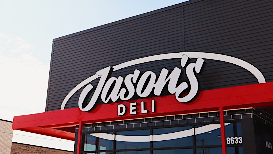
The project was a true co-creation. Kim Collura, Vice President of Marketing, and Jason's creative director led the direction, with the owner joining at key decisions, while Public Type drew and engineered the system. We began with defining the character and practical needs of Jason's itself. Michael looked to early geometric sans serifs, including Erbar-Grotesk from the 1920s, as a historical point of departure, then developed an original system around the brand. Every round was tested in context, using Jason's own menus, website, and brand applications rather than abstract specimen sheets. Proportion, spacing, legibility, and details like straight versus rounded terminals were evaluated where the type would actually have to work. The Jason's team ultimately chose the cleaner, straight finish that became part of both families.
Beaumont and Boerne, two families built to speak as one.
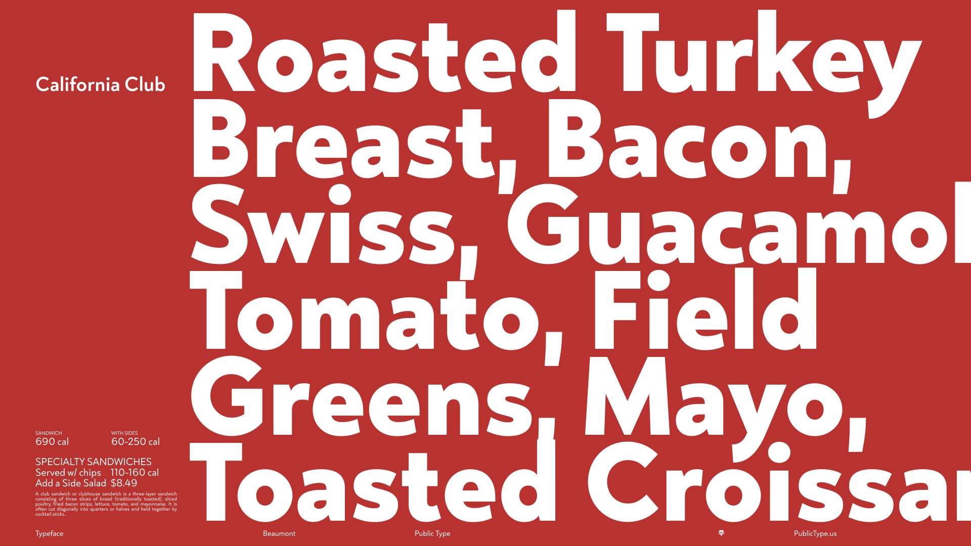
Beaumont takes its name from the Texas city where the first Jason's Deli opened. Designed for menus, running copy, and callouts, its taller lowercase forms, open shapes, and considered spacing make dense information easier to navigate while maintaining the warmth the team wanted from the brand. Boerne, named for another Texas town, is its bold, condensed counterpart for headlines, prices, and promotions. The two families share details and proportions, so a headline and the copy beneath it feel like the same voice at different volumes. And because both names start with B, Beaumont and Boerne sit together in a designer's font menu. We also built Jason's everyday visual language directly into the fonts: the triangle after “Learn More,” arrows, bullets, and other recurring shapes. Designers can type them like any other character instead of using separate graphic elements, ensuring they always match the surrounding type in weight, size, and color.
Custom where it mattered, without paying to own it forever.
The Co-Created model gave Jason's something between a fully custom commission and a custom license. Its team helped shape two original families around the brand, received six months of exclusive use to establish them in market, and licensed them broadly across the organization without taking on the cost of permanent exclusivity or outright ownership. That means Beaumont and Boerne can move with Jason's across menus, packaging, signage, digital, social, advertising, television, and whatever comes next under one clear relationship with Public Type. And because Public Type retains the families, we can continue maintaining and developing them over time. After Jason's six-month exclusive period, Beaumont will join the Public Type library. The result is a model that creates value on both sides: Jason's gets type shaped around its team, brand, and real-world needs at a fraction of the investment of an exclusive commission, while Public Type gets to continue the life of the work.
Credits
Client: Jason's Deli VP of Marketing: Kim Collura Typefaces: Beaumont, Boerne Design Direction: Michael Cina / Public Type Design: Michael Cina, Mirko Velimirovic Year: 2025 Duration: 4 months Format: 2 families, 4 fonts (Beaumont Regular, Bold, Black; Boerne Bold) Model: Co-created. Public Type holds the IP, licensed to Jason's Deli with open usage


