Client

Type design begins as research.
A project like this lives or dies on understanding the source. We spent the early phase deep in Disney's design history, working through Walt's handwriting, animation cells, classic title sequences, and decades of park signage, paying close attention to the quiet typographic decisions the company had been making for as long as it had existed. None of it was referenced directly in the finished work, but all of it was in the room with us. The goal was a typeface that felt Disney from the inside, created from a deep read of the source material rather than a surface impression of it.
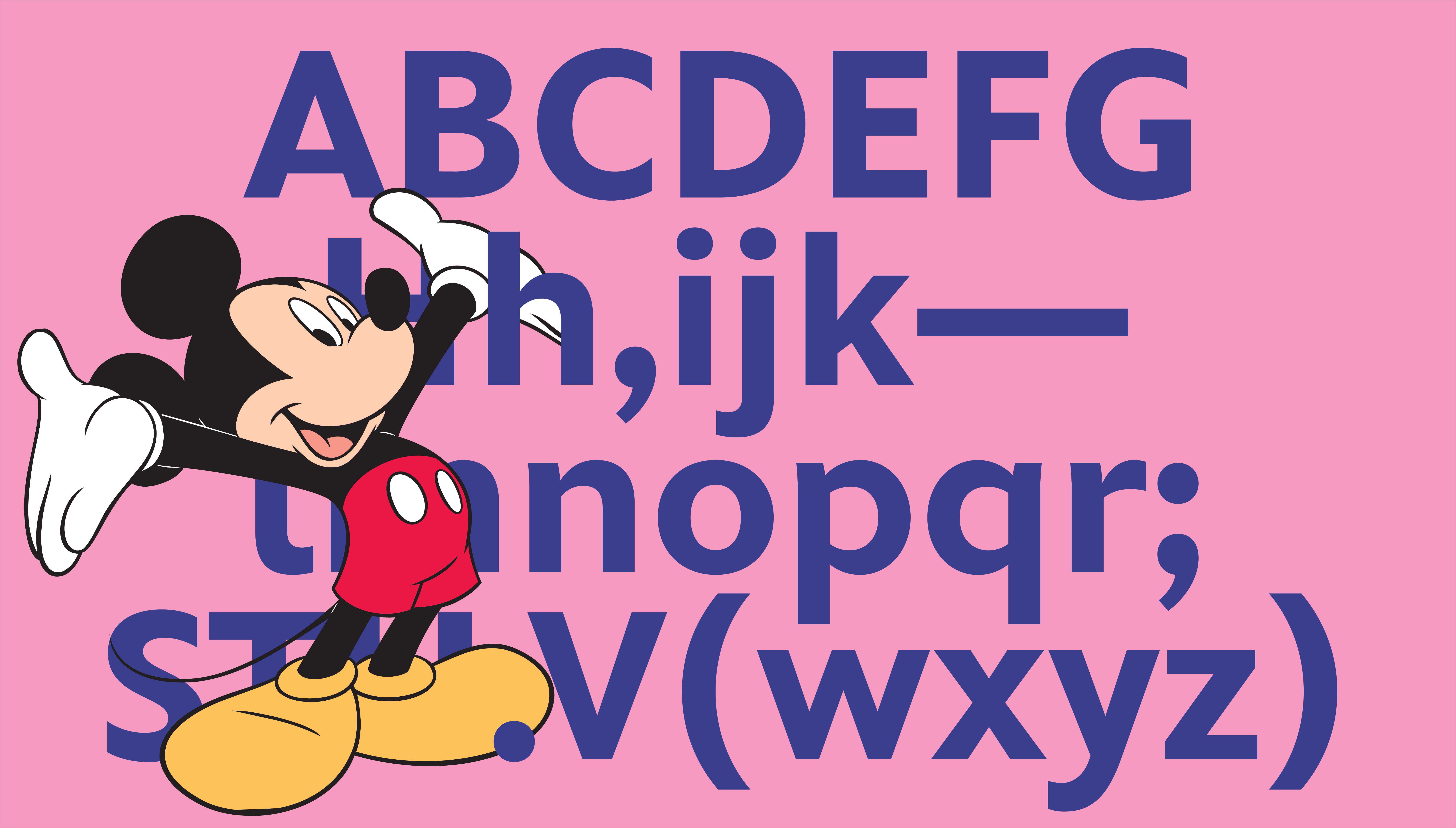
Matterhorn, an exclusive nine-style type system engineered for digital while feeling unmistakably Disney.
Built as three sans weights, three matching italics, and three serifs, the family was created to walk a narrow line. Warm and friendly without ever sliding into cartoon territory, legible enough to carry small text and confident enough to anchor a marquee, stylized in the details and quietly neutral overall so it could sit beside any photograph, any character, any audience Disney needed to reach. Reaching readers from the youngest age to adulthood meant building legibility into the letterforms themselves. Tails on the lowercase l and a help younger readers tell similar shapes apart. Flared joins open up the points where strokes meet, keeping the letters clear at small sizes. Round dots add friendliness. Throughout, we worked to get the letters to smile, to carry genuine warmth without tipping into novelty. The personality lives in how these forms come together, drawn a little differently than most type in its category while staying universal enough that it never calls attention to itself. The harder problem was technical. With no budget for manual hinting, the type still had to render cleanly across screens. So we drew the entire family against a pixel grid defined with Disney early on, then tested it relentlessly until every weight held its shape on screen. It rendered cleanly with no hinting at all, which was rare at the time and saved Disney real production cost downstream. Every weight is built on one shared skeleton, so any combination a designer reaches for stays in rhythm.
Friendly, magical, screen-perfect, and now used across every Disney property.
What started as a website typeface has since become the typographic foundation across Disney's properties: Disney+ interfaces, broadcast graphics, park signage, packaging, food menus, retail stores, theaters, recreation zones, salons, fitness centers, guest services, and a lot of places we never anticipated. The system drives cohesion, recognition, and significant licensing value across the company. The collaboration with Disney's in-house team was one of the best we've had, clear communication and sharp feedback the whole way through. The most magical typeface on earth.

Credits
Client: The Walt Disney Company Typeface: Matterhorn Designers: Michael Cina, Matthew Desmond Year: 2012 Format: 9 weights (3 sans, 3 sans italic, 3 serif) Character set: Latin 1 Duration: 3 to 4 months


